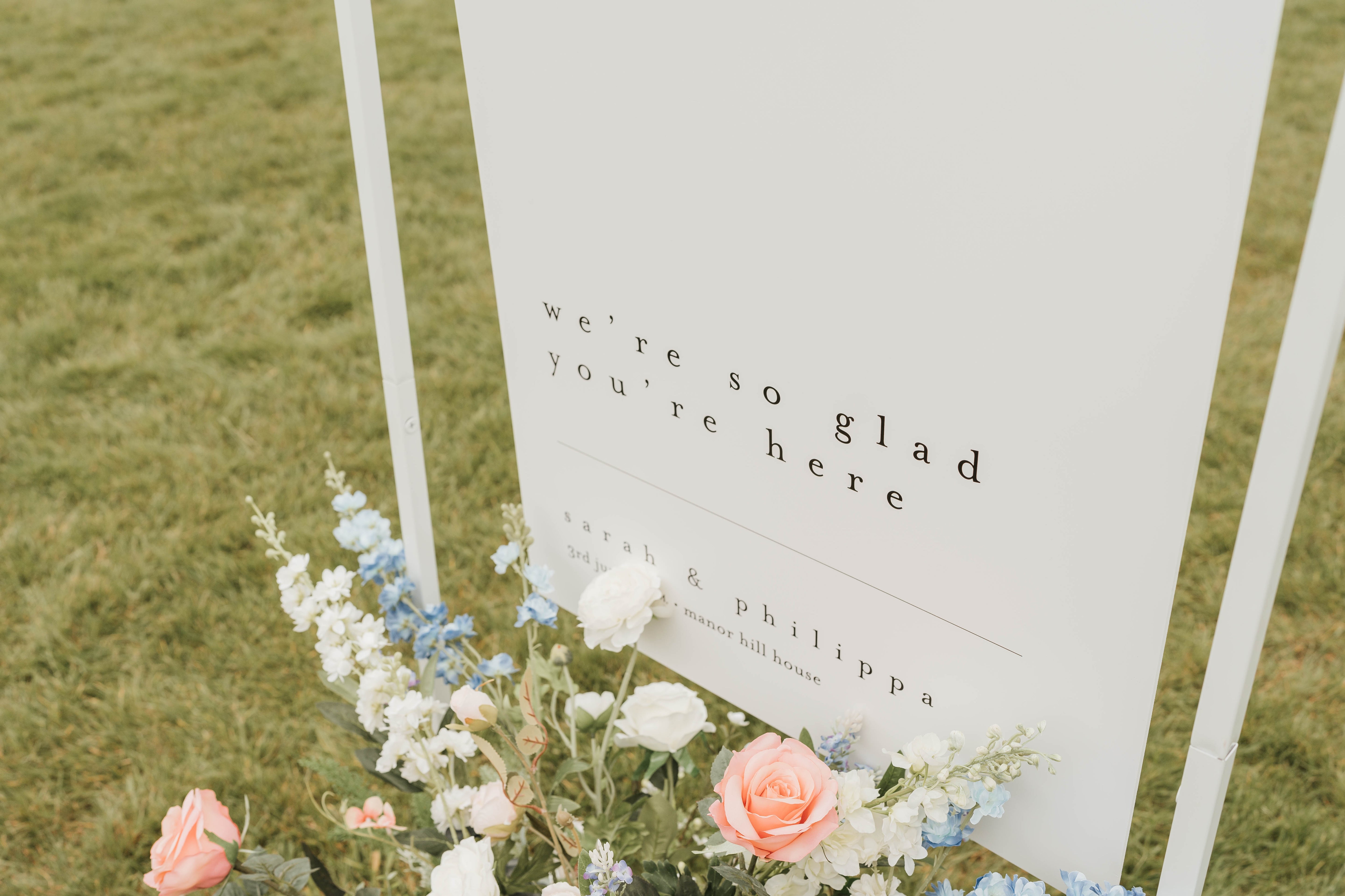
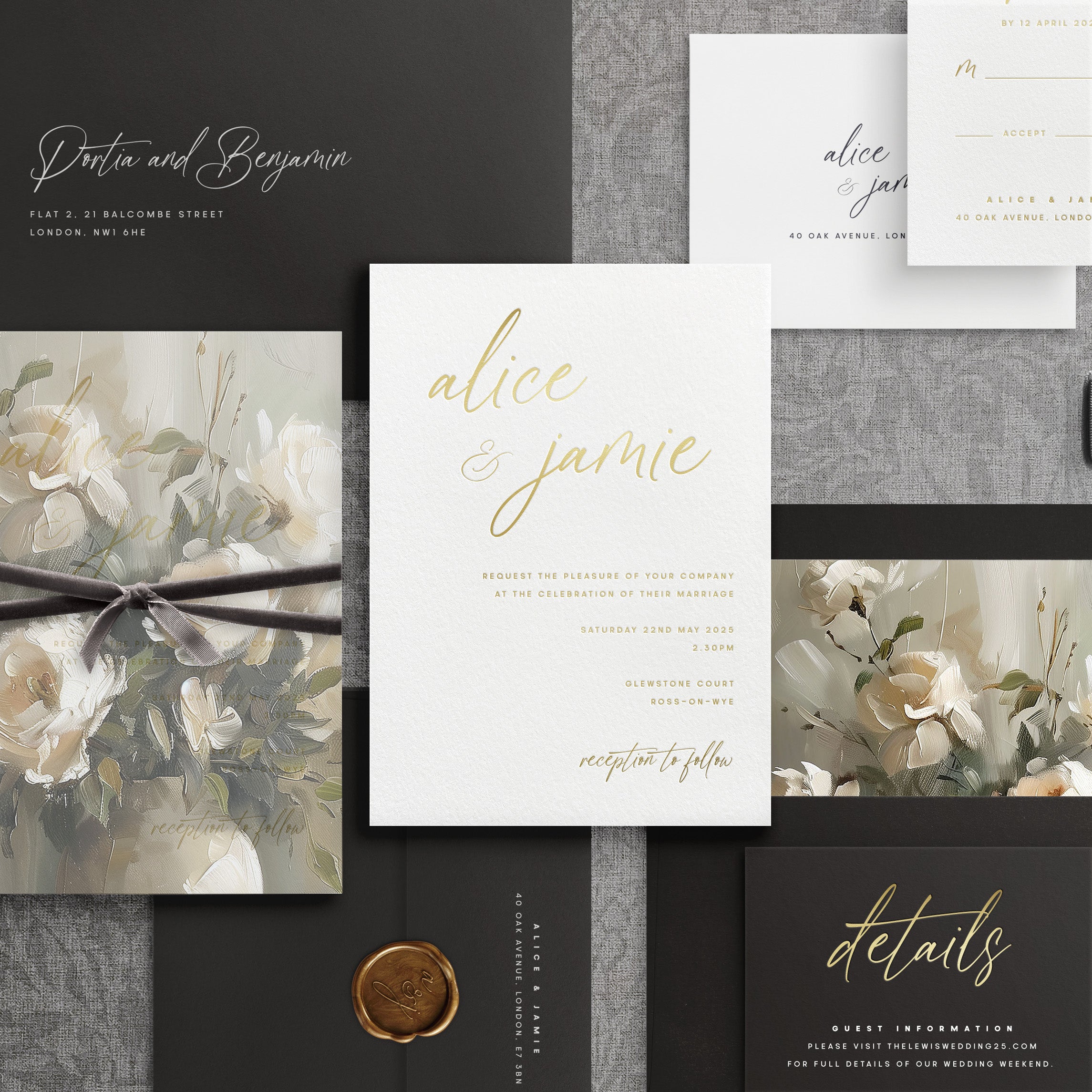
In the last few years wedding websites have become commonplace within the wedding ecosphere. They provide a lot of positives to couples during their planning phase; a single place where all relevant information can be accessed, 24/7 by guests and the couple alike. They save money, too. And sometimes they can also save time collecting replies; allowing a “set and forget” attitude to them, that allows couples to concentrate on other aspects of their wedding planning.
But, as helpful as they are, what do you include on a wedding website?
What to include, and what not to include.
A common misconception is that wedding websites can hold EVERYTHING your guests need, but this isn’t necessarily the case. Yes, they can hold the vast majority of details all in one place, but there are a few things you should tell your guests in their invitations, too.
What to include on your wedding website
Menu – For individual choices, or the set menu everybody is getting
Order of the Day – If you have a lot going on during the day then and order of the day, or order of events can help guests see what you have planned.
Weekend Itinerary - If your wedding is being held over several days, then details of each days itinerary is a must. Most weekend weddings start on a friday evening and conclude on a sunday afternoon. It is not possible to include this much infromation on an inviation, so a wedding website is a definite for this style of wedding.
Map/Directions – Some venues are in the middle of nowhere and therefore can be tricky to find. Some even have different postcodes for different entrances! Therefore a map or directions could be useful for those guest coming from out of town.
Accommodation – Whether its local hotels or if your venue has a number of rooms included in your package, adding these details to a website is a definite.
Taxis – If your venue is in the sticks, a few local taxis details can go on the website and be a handy resource for guests who might want to enjoy a relaxing drink or two.
Parking – some venues have a policy where all guest cars need to be out of the car park by a certain time (usually because they have another event the following day and need the space!) Whilst a little bit inconvenient and denies a lie in, it is important to tell your guests if your venue has such a policy.
Dress Code – A trend for 2024 was the introduction of “colour pallets” for guest attire attending a wedding. This also extended to the style of dress, so if you are a couple who want your guests to come in a certain shade of blue, or want them to dress for Black Tie, then this is a details to include on your website.
Transport – If you are providing transport for guests, details of this should go on the wedding website, along with a section on the RSVP for them to indicate to you if it is required or not.
Cash/Card only bar – Only applicable if the venue accepts one or the other, if they accept both this can be omitted.
Gift Wish/Honeymoon Fund/Gift registry – These are a brilliant part of wedding websites, as a lot of them allow you to plug in a Honeymoon funds or gift registry, meaning guests can access these details and buy a gift, or donate to your holiday fund right from within the website – meaning all they need to worry about bringing you is a card. This also makes it safer for you during the day, as it is not unheard of for cards including cash or gifts to go missing on the wedding day if left in a box or in the open.
RSVP’s – Another fantastic part of wedding websites. They can collate the details from all guests rsvping, and also include menu choices, dietary requirements and any additional details you might want (song for your playlist, transport or accommodation choices etc). You may also find some website collate the responses in a spreadsheet which you can then send directly to your caterer/venue for confirmed numbers and/or menu choices.
What NOT to include on your wedding website
So we’ve covered what you should put on a wedding website, but is there anything that you shouldn’t. The simple answer is yes – there is. And there is one simple reason why. Wedding websites are great but as we will cover further on, they do have their downsides, and one of them is that it can easily be forgotten about.
Some information is too important to be missed, and should be included with an invitation so they have access to it right upfront.
Children policy – This should be included with a physical invitation. It is a controversial topic within some family circles so it is best that, if you do have a policy on no children, this is included upfront and not hidden within a wedding website, where it can easily be missed (or ignored!)
Confetti Policy – Venues are getting increasingly strict with allowing confetti, and if they do allow it, it being a specific type. A lot will also include a hefty clean up fee if the policy is not adhered to, so to avoid any confusion it is better to put this policy on a physical invitation. You can also include it on the website as there is no harm in duplicating, but guest are more likely to read what is in front of them first, rather than access a website on a phone.
Reference to what IS on the website – If opting for a wedding website, it is helpful to include a breakdown of what guests can find on the website so they can pinpoint details that are specific to them. It is also a good reminder for them to RSVP and check timings etc.
What are the downsides of a wedding website?
We have covered a lot of what a wedding website can do, and the positives are glaring.
But, they do have their own drawbacks too…
Time to build it – a lot are drag and drop but compiling and editing information can take a time
Free, or are they? - The majority in the UK are free, but a small number have extras that you have to pay for – watch out for this
Security – Make sure they have password and the website provide has a SSL certificate – otherwise details of your wedding may be accessible by anyone! Also, if you have a cash app attached, card details may not be safe without this certificate!
Locations of the website host – some places are not based in the UK and therefore only allow for same country honeymoon funds to be linked etc.
Consider elderly/not tech savvy guests - No everyone can access information digitally, or wants to. Keep this in mind for some of the elderly guests.
QR codes might not be aesthetically pleasing - Some couples don’t like the look of a QR code on their invites, and URL's for wedding website can be long and complicated to type. Whilst a minor consideration, couples who see stationery as an important part of their day may find QR codes to encroach on the style of their invite.
Another element to this is that some stationer wont print QR codes on their work, so make sure to ask this question prior to working with a stationer.
Any future updates might be missed – whilst website can be accessed 24/7, if you have to update something on it, you can’t guarantee this information will be seen once your guests RSVP. So even with a website, you still may find yourself having to contact each guest to tell them to check it again.
Day and Evening Guests - Differentiating between day and evening guests may mean you need to set up two websites, and not one as day and evening guest will require different information. This can lead to complications, two different urls/sets of passwords/ QR codes and maybe more of a headache than it worth.
Our Verdict
Wedding websites are a fantastic aid to couples planning their wedding, but there are considerations to make when wanting to use them. However, these should not put couples off from incorporating them; they are a fantastic resource and can really aid in the planning process.
For those couples who love the tactile nature of Invitations and are not fond of this new digital age we are in, there are still many options available without the use of digital aids. The world, therefore, is everyone's oyster and there is something out there for everyone.
Best Wedding Invitations to accompany a Wedding Website
We have two styles of invitation that works perfectly with a wedding website.
Our Shaped Suites – designed with minimal information, maximum wow factor


